Aera Botanicals
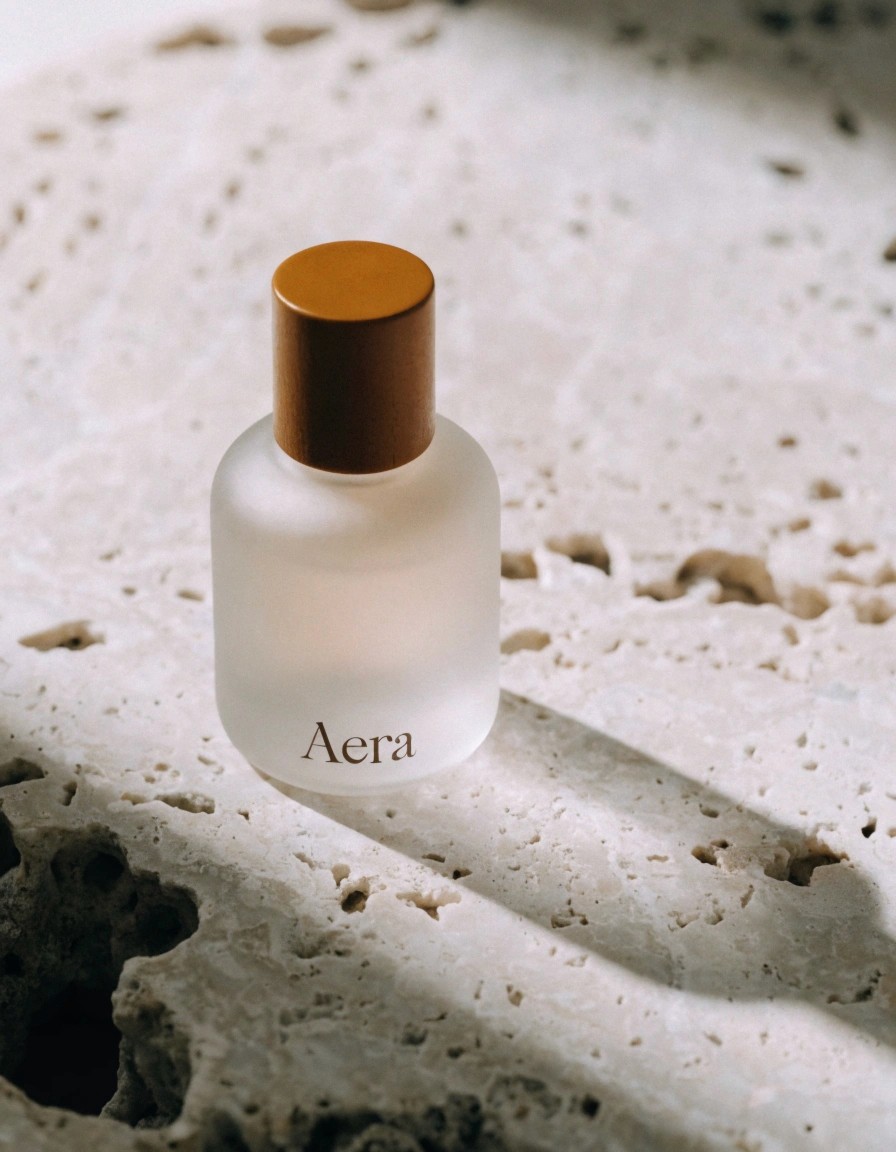
They understood that our fragrances were built from a handful of named compounds, and gave us a system with that same precision. The bottle finally looks like what's inside it.

Marguerite Sol
Founder, Aera Botanicals
12
Fragrance SKUs Designed
3×
Increase in Retail Orders
8 wks
Brand-to-Launch Timeline
94%
Customer Satisfaction Score
The Brief
Aera Botanicals came to us with a fragrance line that smelled remarkable but looked like everyone else’s shelf-filler: minimal-by-default, forgettable-by-design. They needed a name, a visual system and packaging that matched the precision of what was inside the bottle.
The Approach
We started at the molecular level, literally. Each scent in the collection is built from a small number of named compounds, so we built the identity the same way: a restrained mark, a single accent colour per fragrance, and a typographic system that reads like a lab notation rather than a lifestyle ad.
A wordmark drawn to feel machine-precise but warm in execution
A modular labelling system that scales from a 10ml sample to a 200ml refill
Packaging structure engineered to reduce material waste by 30%
The Result
The rebrand repositioned Aera from a niche indie label to a considered, collectible fragrance house. Sell-through on the redesigned line increased within the first retail cycle, and the pack has since been used as the template for every new scent the brand releases.
Every element earns its place on the bottle. Nothing is there to decorate — it’s there to inform.